see: github
1 示例一
1.1 HTML
<!doctype html>
<html lang="en">
<head>
<meta charset="UTF-8" />
<meta name="viewport" content="width=device-width, initial-scale=1.0" />
<title>Simple Admin Layout</title>
<script type="text/javascript">
function getStyle(id, name) {
var element = document.getElementById(id);
return element.currentStyle ? element.currentStyle[name] : window.getComputedStyle ? window.getComputedStyle(element, null).getPropertyValue(name) : null;
}
function toggleSidebar() {
var sidebar = document.getElementById('sidebar-wrapper');
var drawerBg = document.getElementById('drawer-bg');
var width = document.body.clientWidth;
if (width > 1200) {
sidebar.classList.remove('sidebar-wrapper-middle-hide');
sidebar.classList.remove('sidebar-wrapper-small-show');
drawerBg.classList.remove('drawer-bg-small-show');
sidebar.classList.toggle('sidebar-wrapper-big-hide');
} else if (width <= 768) {
sidebar.classList.remove('sidebar-wrapper-big-hide');
sidebar.classList.remove('sidebar-wrapper-middle-hide');
sidebar.classList.toggle('sidebar-wrapper-small-show');
drawerBg.classList.toggle('drawer-bg-small-show');
} else {
sidebar.classList.remove('sidebar-wrapper-big-hide');
sidebar.classList.remove('sidebar-wrapper-small-show');
drawerBg.classList.remove('drawer-bg-small-show');
sidebar.classList.toggle('sidebar-wrapper-middle-hide');
}
if (getStyle('sidebar-wrapper', 'display') == 'block') {
document.getElementById('btnToggle').innerHTML = '<<';
} else {
document.getElementById('btnToggle').innerHTML = '>>';
}
}
function toggleFullScreen() {}
</script>
<style>
html,
body {
width: 100%;
height: 100%;
margin: 0;
padding: 0;
overflow: hidden;
}
.app-wrapper {
display: flex;
height: 100%;
}
.sidebar-wrapper {
flex: 0 0 160px;
display: block;
overflow: auto;
background: lightblue;
}
.main-wrapper {
display: flex;
flex: 1 1 auto;
flex-direction: column;
}
.header-wrapper {
flex: 0 0 50px;
display: flex;
align-items: center;
justify-content: space-between;
background: lightgreen;
}
.content-wrapper {
flex: 1 1 auto;
height: calc(100% - 50px);
background: lightpink;
overflow: auto;
}
</style>
<style>
/* all: 大屏(>=1200px) */
@media (min-width: 1200px) {
.sidebar-wrapper-big-hide {
display: none;
}
}
</style>
<style>
/* 中屏(>768px && < 1200px) */
@media (max-width: 1200px) and (min-width: 768px) {
.sidebar-wrapper {
flex: 0 0 40px;
display: block;
overflow: hidden;
}
.sidebar-wrapper-middle-hide {
display: none;
}
}
</style>
<style>
/* all: 小屏(<768px) */
@media (max-width: 768px) {
.sidebar-wrapper {
position: absolute;
top: 0;
left: 0;
z-index: 1001;
height: 100%;
display: none;
}
.drawer-bg {
position: absolute;
top: 0;
left: 0;
z-index: 1000;
width: 100%;
height: 100%;
background: #000;
opacity: 0.3;
display: none;
}
#sidebar-wrapper.sidebar-wrapper-small-show,
#drawer-bg.drawer-bg-small-show {
display: block;
}
}
</style>
</head>
<body>
<div class="app-wrapper">
<!-- 手机设备侧边栏打开遮罩层 -->
<div id="drawer-bg" class="drawer-bg" onclick="toggleSidebar()"></div>
<div id="sidebar-wrapper" class="sidebar-wrapper">sidebar-wrapper</div>
<div class="main-wrapper">
<div class="header-wrapper">
<div>
<button id="btnToggle" onclick="toggleSidebar()"><<</button>
</div>
<div>全屏 头像</div>
</div>
<div class="content-wrapper">Content</div>
</div>
</div>
</body>
</html>
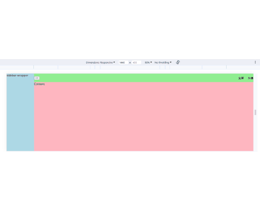
1.2 效果
2 示例二
2.1 HTML
<!DOCTYPE html>
<html lang="en">
<head>
<meta charset="UTF-8" />
<meta name="viewport" content="width=device-width, initial-scale=1.0" />
<title>Simple Admin Layout</title>
<script type="text/javascript">
const smallMaxWidth = 768; // px
const middleMaxWidth = 1200; // px
const sidebarShortWidth = 54; // px
function getStyle(id, name) {
var element = document.getElementById(id);
return element.currentStyle
? element.currentStyle[name]
: window.getComputedStyle
? window.getComputedStyle(element, null).getPropertyValue(name)
: null;
}
function toggleSidebar() {
var sidebar = document.getElementById("sidebar-wrapper");
var drawerBg = document.getElementById("drawer-bg");
var width = document.body.clientWidth;
if (width > middleMaxWidth) {
sidebar.classList.remove("sidebar-wrapper-middle-show");
sidebar.classList.remove("sidebar-wrapper-small-show");
drawerBg.classList.remove("drawer-bg-small-show");
sidebar.classList.toggle("sidebar-wrapper-big-hide");
} else if (width <= smallMaxWidth) {
sidebar.classList.remove("sidebar-wrapper-big-hide");
sidebar.classList.remove("sidebar-wrapper-middle-show");
sidebar.classList.toggle("sidebar-wrapper-small-show");
drawerBg.classList.toggle("drawer-bg-small-show");
} else {
sidebar.classList.remove("sidebar-wrapper-big-hide");
sidebar.classList.remove("sidebar-wrapper-small-show");
drawerBg.classList.remove("drawer-bg-small-show");
sidebar.classList.toggle("sidebar-wrapper-middle-show");
}
if (sidebar.clientWidth > sidebarShortWidth) {
document.getElementById("btnToggle").innerHTML = "<<";
} else {
document.getElementById("btnToggle").innerHTML = ">>";
}
}
function toggleFullScreen() {}
function toggleFullContent() {
var sidebar = document.getElementById("sidebar-wrapper");
var header = document.getElementById("header-wrapper");
var content = document.getElementById("content-wrapper");
sidebar.classList.toggle("sidebar-wrapper-full-content");
header.classList.toggle("header-wrapper-full-content");
content.classList.toggle("content-wrapper-full-content");
}
window.addEventListener("resize", (event) => {
var sidebar = document.getElementById("sidebar-wrapper");
var drawerBg = document.getElementById("drawer-bg");
sidebar.classList.remove("sidebar-wrapper-big-hide");
sidebar.classList.remove("sidebar-wrapper-small-show");
sidebar.classList.remove("sidebar-wrapper-middle-show");
drawerBg.classList.remove("drawer-bg-small-show");
});
</script>
<style>
/* @media (min-width: 768px)
@media (min-width: 992px)
@media (min-width: 1200px)
@media (max-width: 767px) */
html,
body {
width: 100%;
height: 100%;
margin: 0;
padding: 0;
overflow: hidden;
}
.app-wrapper {
display: flex;
height: 100%;
}
.sidebar-wrapper {
flex: 0 0 210px;
display: block;
overflow: auto;
background: lightblue;
}
.main-wrapper {
display: flex;
flex: 1 1 auto;
flex-direction: column;
}
.header-wrapper {
flex: 0 0 50px;
display: flex;
overflow: hidden;
align-items: center;
justify-content: space-between;
background: lightgreen;
}
.content-wrapper {
flex: 1 1 auto;
height: calc(100% - 50px);
background: lightpink;
overflow: auto;
}
</style>
<style>
/* 大屏 & 中屏(>768px) */
@media (min-width: 768px) {
.sidebar-wrapper-full-content {
/* flex: 0 0 0 !important;
overflow: hidden; */
display: none !important;
}
.header-wrapper-full-content {
/* flex: 0 0 0 !important;
overflow: hidden; */
display: none !important;
}
.content-wrapper-full-content {
height: 100%;
}
}
</style>
<style>
/* all: 大屏(>=1200px) */
@media (min-width: 1200px) {
.sidebar-wrapper-big-hide {
/*display: none;*/
flex: 0 0 54px;
display: block;
}
}
</style>
<style>
/* 中屏(>768px && < 1200px) */
@media (max-width: 1200px) and (min-width: 768px) {
.sidebar-wrapper {
flex: 0 0 54px;
display: block;
overflow: hidden;
}
.sidebar-wrapper-middle-show {
flex: 0 0 210px;
display: block;
}
}
</style>
<style>
/* all: 小屏(<768px) */
@media (max-width: 768px) {
.sidebar-wrapper {
position: absolute;
top: 0;
left: 0;
z-index: 1001;
height: 100%;
display: none;
}
.drawer-bg {
position: absolute;
top: 0;
left: 0;
z-index: 1000;
width: 100%;
height: 100%;
background: #000;
opacity: 0.3;
display: none;
}
#sidebar-wrapper.sidebar-wrapper-small-show,
#drawer-bg.drawer-bg-small-show {
display: block;
}
}
</style>
</head>
<body>
<div class="app-wrapper">
<!-- 手机设备侧边栏打开遮罩层 -->
<div id="drawer-bg" class="drawer-bg" onclick="toggleSidebar()"></div>
<div id="sidebar-wrapper" class="sidebar-wrapper">sidebar-wrapper</div>
<div class="main-wrapper">
<div id="header-wrapper" class="header-wrapper">
<div>
<button id="btnToggle" onclick="toggleSidebar()"><<</button>
</div>
<div>全屏 头像</div>
</div>
<div id="content-wrapper" class="content-wrapper">
Content
<button onclick="toggleFullContent()">全屏</button>
</div>
</div>
</div>
</body>
</html>